
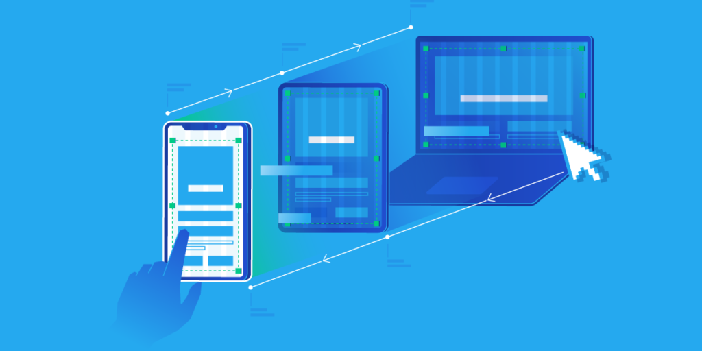
The web has come a long way since its text-based beginnings. Today, users access information on a vast array of devices, from desktops and laptops to tablets and smartphones. This ever-evolving landscape has demanded a design approach that can adapt and deliver an optimal experience on any screen – enter Responsive Website Design (RWD).
From Fixed Layouts to Responsive Revolution (website design company in india)
In the early days of the web, websites were designed with a fixed layout, typically optimized for a standard desktop screen size. This one-size-fits-all approach created a frustrating user experience for anyone accessing the site from a smaller device. Scrolling became a nightmare, text was unreadable, and navigation was cumbersome.
The need for a solution arose with the rise of mobile internet browsing in the late 2000s. In 2010, Ethan Marcotte coined the term “Responsive Website Design” in a seminal article, outlining a new approach that prioritized flexibility. Websites built with RWD principles could adapt their layout based on the user’s device and screen size, ensuring a seamless browsing experience across desktops, tablets, and mobiles.
The Building Blocks of Responsive Website Design
Several key technologies have been instrumental in the development and continuous improvement of RWD:
- Fluid Grid Systems: These grids use percentages instead of fixed pixels to define the layout. This allows elements like columns and margins to adjust proportionally based on the screen size.
- Media Queries: Introduced in CSS3, media queries allow developers to define specific styles based on various device characteristics like screen size, orientation, and resolution. This enables targeted adjustments to the layout for different devices.
- Flexible Images and Multimedia: Images and videos can be resized or even swapped for alternative versions depending on the device. This ensures optimal loading times and a visually pleasing experience across platforms.
Beyond the Basics: The Evolution Continues
Responsive website design company in india has matured significantly since its inception. Here are some key trends shaping its evolution:
- Mobile-First Approach: With the majority of web traffic now originating from mobile devices, many designers now adopt a mobile-first approach. This means prioritizing the mobile experience and then scaling up for larger screens.
- Flexible Typography: RWD goes beyond layout; it ensures content readability on all devices. Flexible typography allows font sizes, line heights, and letter spacing to adjust dynamically based on screen size.
- CSS Grid and Flexbox: These advanced CSS features provide even greater control over layout and responsiveness. They enable complex layouts to adapt seamlessly across devices.
- Progressive Enhancement: This approach involves building a basic website that functions well on all devices and then progressively adding features and enhancements for more capable browsers.

The Benefits of Responsive Website Design
Adopting a responsive design approach offers a multitude of benefits for both users and website owners: web design price in india
- Improved User Experience: Users can access and interact with websites seamlessly across all devices, leading to higher satisfaction and engagement.
- Reduced Maintenance: Maintaining a single responsive website is easier and more cost-effective than managing separate versions for different devices.
- Enhanced SEO: Responsive design is a major ranking factor for search engines like Google. A responsive website will be more easily discoverable across all devices.
- Increased Visibility: By catering to all devices, responsive websites reach a wider audience and have the potential to increase conversions.
The Road Ahead: The Future of Responsive Website Design
The future of responsive design is bright and ever-evolving. Here are some exciting possibilities on the horizon:
- Device Agnostic Design: As foldable phones, wearables, and other innovative devices emerge, responsive design will need to adapt to address their unique form factors and interactions.
- Voice Search Optimization: With the rise of voice search assistants, RWD will need to incorporate voice interaction considerations to ensure optimal user experience.
- Personalization: Responsive design might integrate with user data to personalize the layout and content based on individual preferences and browsing habits.
Check out the latest election update at Election Leader’s India’s first online election poll and news!
Conclusion: Responsive Website Design – A Necessity, Not a Luxury
In today’s dynamic web landscape, a responsive website design company in india is no longer an optional add-on; it’s a fundamental requirement for any successful website. By embracing the principles of RWD and staying updated with the latest trends, website owners can ensure that their online presence remains adaptable, user-friendly, and effective across all devices and platforms.
This article provides a basic overview of the evolution of responsive website design company in india. If you’d like to delve deeper, consider exploring specific technologies like media queries, CSS Grid, or Flexbox. Numerous online resources and tutorials can help you gain a more practical understanding of implementing responsive design principles in your web development projects.